My New Meal Planning Planner
Do you have a chore or home responsibility that you dread doing? For me, it’s cooking. When I’m in the mood to cook, I love it. However, most days I’m not in the mood to cook. Plus, I really suck at remembering to take something out for dinner.
This year I’m trying to get better at being prepared. Less soup and sandwiches, more varied dinners. Since I’m the one doing most of the cooking, I knew I needed help. I turned to a tool I know will help – meal planning. But I really, and I do mean REALLY, didn’t want to put a lot of thought or work into my meal planner. My solution was to go buy one.
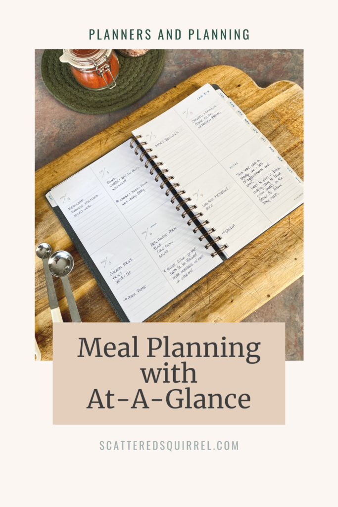
This post is sponsored by our friends at At-A-Glance. They have a whole lineup of planners in different sizes, layouts, styles, and price points. The planner featured in this post was one I purchased myself and all thoughts and opinions are my own. This post also contains affiliate links. For more information, please see the disclosure policy.
Meal Planning with At-Glance
My Mom came with me when I went shopping for this planner and oh boy, did we have a lot of fun pouring over all the different planners. I have to say, I honestly haven’t spent much time looking at planners in stores recently, so I was pleasantly surprised by the variety. At-A-Glance has so many options in different price points.
It was hard to narrow down my choice to just one. Every time I picked up a different one I could see the endless possibilities for how to use it. Having a specific use in mind allowed me to narrow my choices to a weekly planner that wasn’t too big. And this is the one I ended up with an At-A-Glance Weekly Planner.
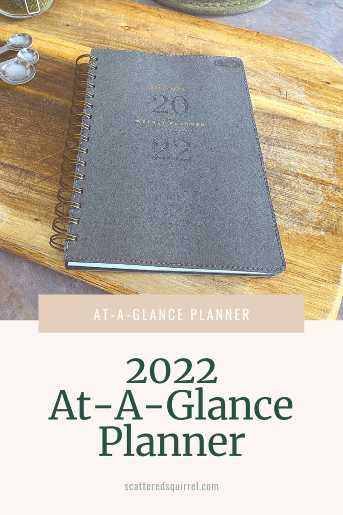
I really loved the boxed layout of the week. Each day having the same amount of planning space was a must. The notes box is proving to be really helpful as well. Let me show you how I’m using it.
The Monthly Calendar
At first, I didn’t think I would use the monthly calendar at all. I have a system I use for monthly planning that I’ll be sharing soon, so I was pretty sure these ones would just remain empty. However, I need my meal planning to be easy if I’m going to stick with it and I realized that the monthly calendar was the perfect space to mark down things that might impact mealtime.
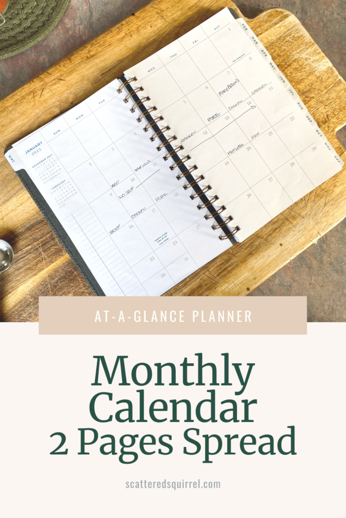
As you can see in the photo, this week I didn’t have access to my vehicle, which means I had to make sure my meal plan didn’t include anything I didn’t have on hand. We have a couple of busy weeks coming up where I’m not going to be at home for most of the day some days, so that means when I’m planning my meals for the week I need to plan to make extras for leftovers on those nights.
I was trying to use it to plan the protein for the week, to make sure I’m not serving only chicken one week. I realized pretty quickly that I was just doubling up my planning when I didn’t really need to.
I’m also thinking it might be a good place to track when I do batch cooking. That way I have a reference in my meal planner for when I made certain things. It’s an evolving process, and I’ll be sure to update you on how it’s going in case this is something that might work for you.
The Weekly Pages
These are the crucial pages of this planner. It’s a two pages per week layout in a boxed design. Monday – Thursday are on one page, Friday to Sunday on the next with a notes box filling in the empty section.
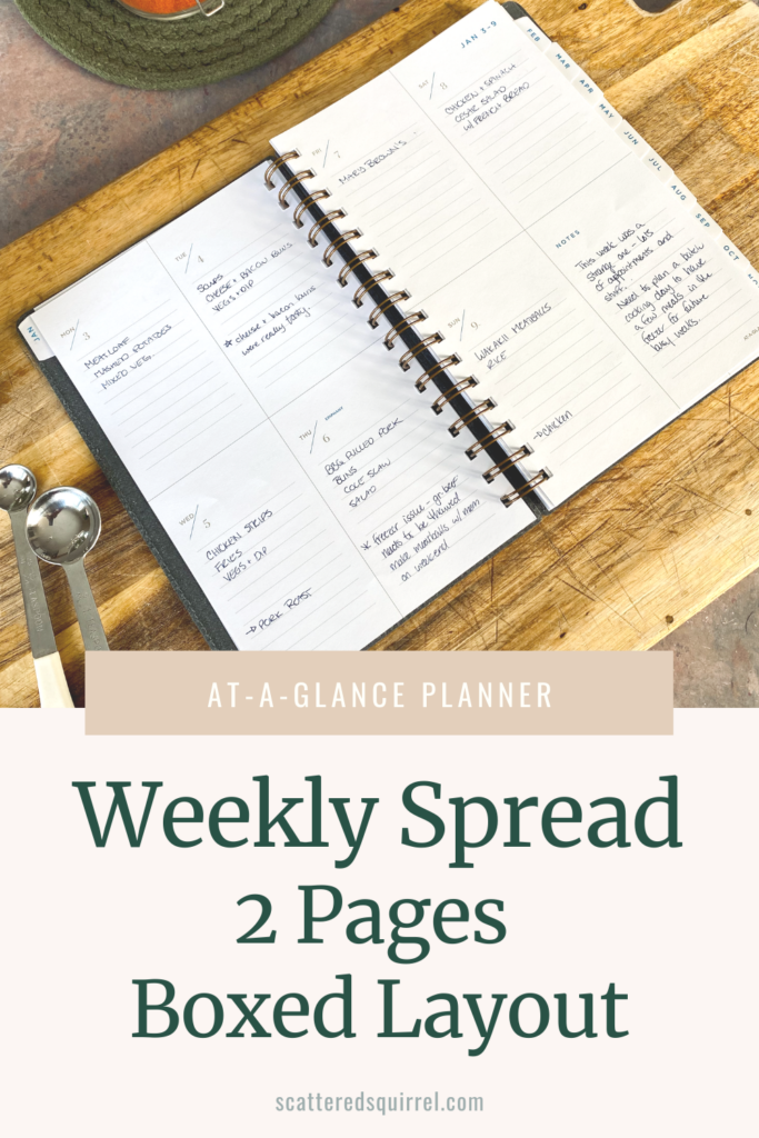
Basically, I fill in what I’m making for each day. Then I go back and mark down what I need to take out of the freezer on what day. This has been amazingly helpful for keeping me on track. I’m not pulling something out at 2 pm and then having to defrost it in the microwave or something. Which, to be honest, has become somewhat of a habit that I really want to change.
There’s plenty of room in the daily boxes to make all these plans with room left over for notes. Like the day we tried new bacon and cheese buns from a local bakery. I made a note that the buns were pretty good. We’ve been trying out some new recipes lately and I think this is going to be a great place to note whether they were a hit or not.
My plan for the Notes box is to use it to tweak my meal planning. Last week I noted that it was a weird week with lots of appointments. I also noted that I need to plan a batch cooking day so I have some meals ready to go for future busy weeks. Having a place to keep notes like that, outside of my day to day planner, has been helpful so far.
Let’s Take a Closer Look at the Planner
The first thing that caught my attention with this planner is the size. I didn’t want anything too big for just meal planning. I wanted it to be portable in case I want to take it with me when I do the grocery shopping. Also, I really need a whole week in one spread. It’s basically a half-letter size measuring 5 3/8″ by 8 1/2″.
The minimal design of the interior was really appealing as well. I love that the colours are limited, the lines are thin, and there’s white space in the weekly layouts. The fonts are easy to read but they’re lighter weight and don’t take over the whole page as some heavier fonts can. And the paper itself is a good weight and fairly smooth which makes writing on it very nice.
A Look at All the Pages in the At-A-Glance Planner
As with most planners, the monthly calendar and weekly or daily planning pages are the bulk of the planner. However, most planners also have some extras thrown in. So let’s take a look at rest of the pages.
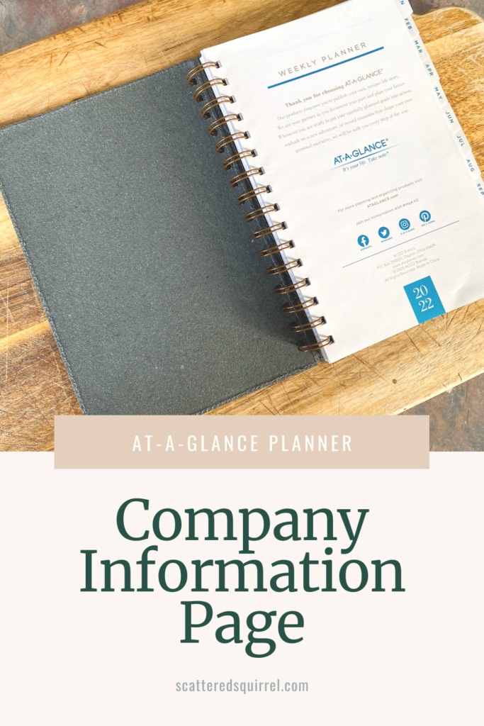
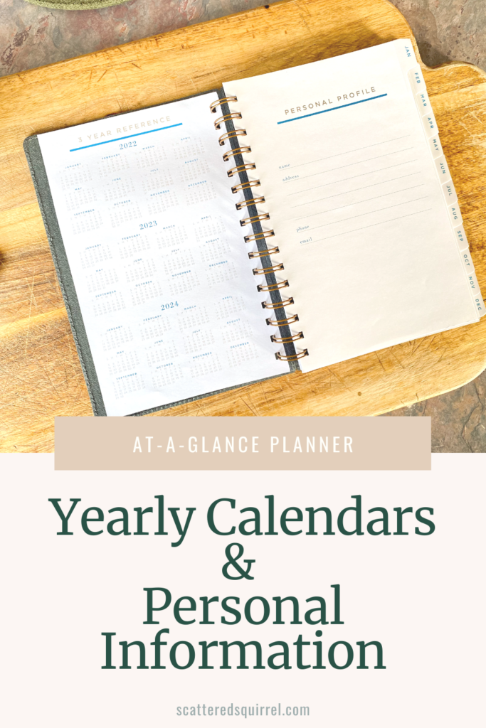
The planner opens to the company information page. Following that you have yearly calendars for 3 years and your personal profile page.
From there you go right into the Jaunary calendar, followed by all the dated weeks for the month. This repeats for all the months. One of the nice features of this planner is that At-A-Glance also includes January 2023, so you have a bit of a buffer when it comes time to choose your new planner for next year.
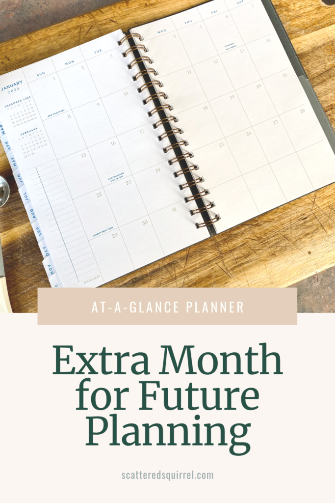
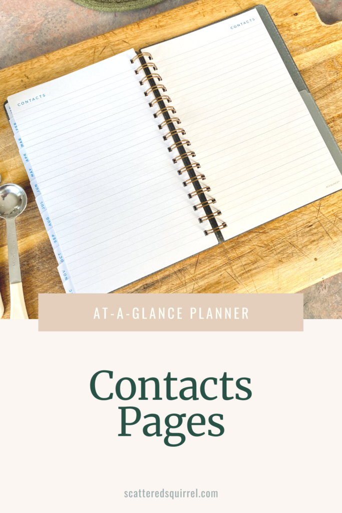
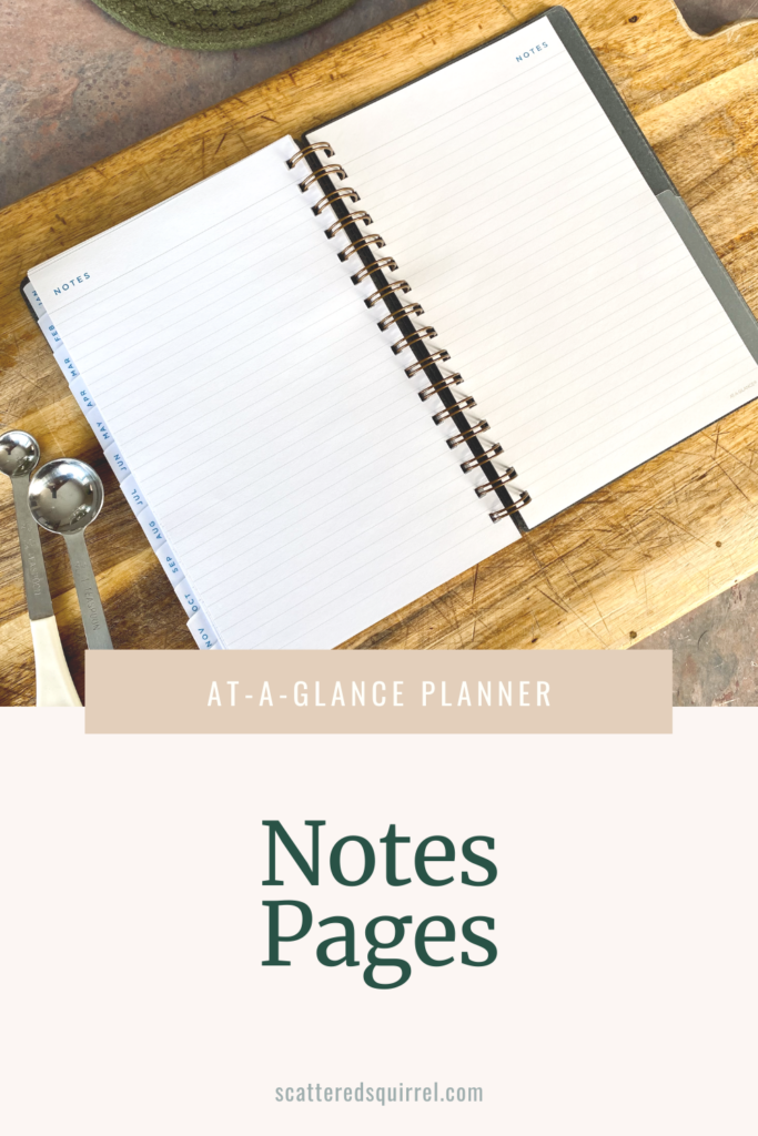
After that you have five pages for contacts and six pages for notes. Because I’m using this planner soley for meal planning, I’m thinking of using the contacts pages to note our favourite take-out places, specialty food stores, and places where we get most of our meal ideas. I’m not sure what I’ll be using the notes pages for, but I’m thinking that would be a good place to make a list of our family’s favourite meals.
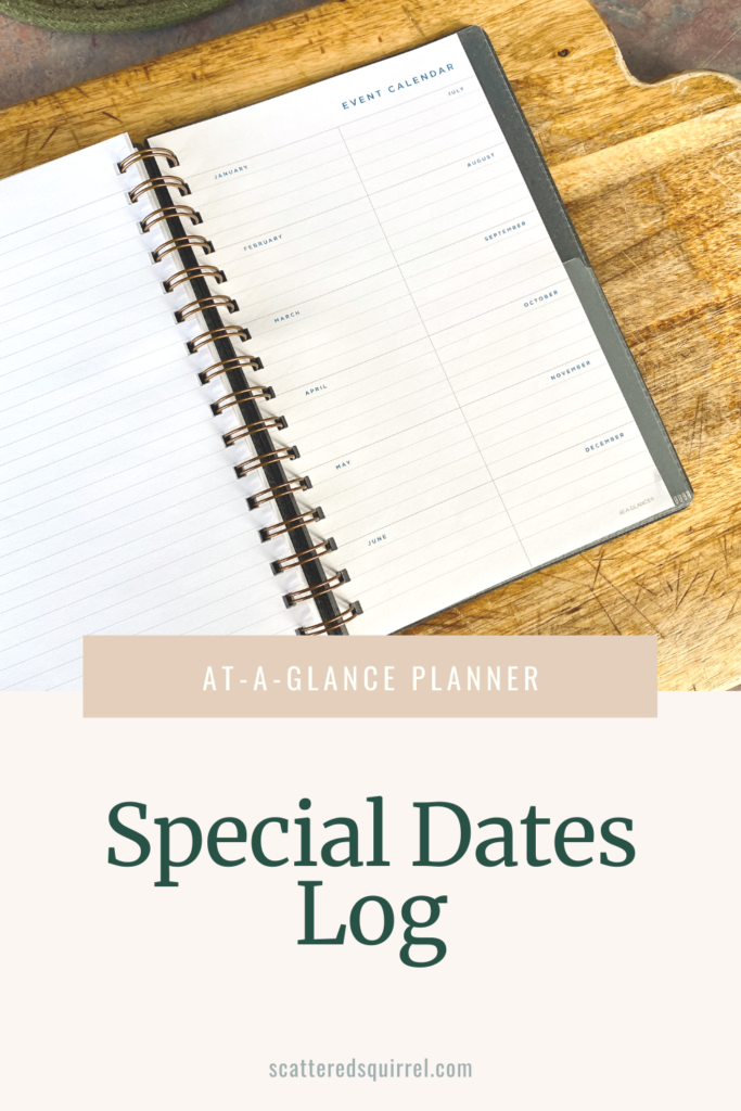
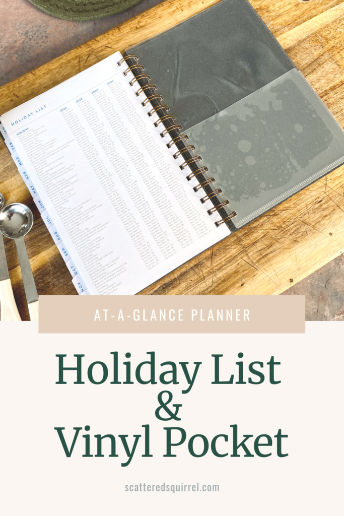
At the end of the notes section you have a place for recording special dates or events. That’s follwed by a list of holidays and their dates for the next four years and a vinyl pocket at the end of the planner.
My Thoughts on the At-A-Glance Planner
I’m pretty picky about my planners, it’s one of the reasons I make my own each year. Truthfully, At-A-Glance planners are not new to me, I’ve used them many times in the past. One of my favourite things about this company is that they offer planners at different price points.
When I went to choose my planner, I picked one that middle of the road. This planner cost me $35 Canadian, and I think it’s well worth the price.
The Paper
The paper isn’t overly thick and it’s smooth but there’s a little texture to it as well which I really like. I typically only use pens and highlighters for meal planning, so I did a pen test for you. It’s one of my favourite parts of planner reveiws because we can’t exactly pen test the paper before we buy it.
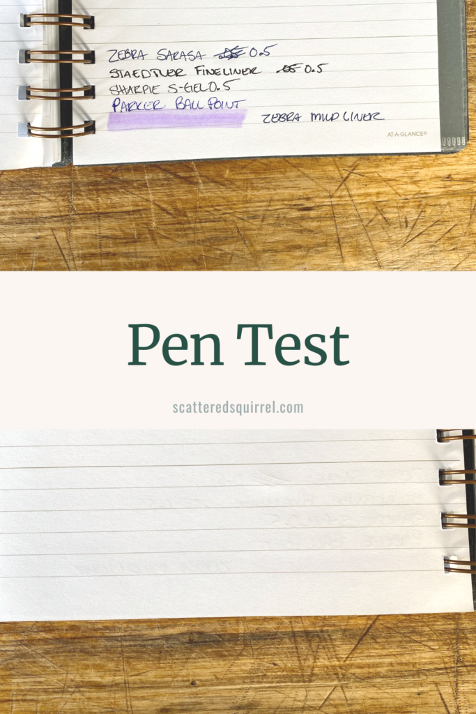
It’s a little hard to see in the photo, but there is some ghosting with all the pens, but none bled through. I was actually surprised the highlight didn’t because it was wet when I first laid it down.
The Binding and Covers
The binding is wire o binding, which I honestly don’t mind. I will say it’s a little on the thinner side, and if this was a planner I was taking with me on the go, I might consider getting a pouch or something help protect the binding.
The covers are feel really durable. They have a suede like finish and really sturdy but not rigid. The stitiching around the eddges is a really nice touch. I’ve been using this for over a month now and the finish on the cover is holding up really well.
The Interior
One of the features that sold me on this planner versus some of their other ones was the colour palette of the interior. They used a nice medium to light brown colour for all the lines, dates, and some of the text. That’s accented by a beautiful mid-tone blue that’s vibrant without being too in your face. The blue is used for monthly titles, days of the week labels on the calendars, for noting holidays, and as accents here and there. It’s a little pop of colour that isn’t too distracting.
I also really like the fonts they chose. They mostly use a sans-serif font in all captials which makes the smaller font really easy to read. The chose a serif font for the dates on the monthly calendars and weekly spreads and I think it helps the numbers stand out just a little.
The extra pages in the back, especially a whole extra month of planning pages, are a really nice touch. I also appreciate that the contacts pages, while labeled Contacts, are basically blank slates so you could use them for extra notes pages if you don’t want to keep contacts in your planner.
Touches like that always show me that whoever designed the planner really put some thought into how people might need to use it.
Because this planner is on the smaller side, the space for planning isn’t huge. For what I’m using it for it’s plenty of room. I could also probably use this planner for regular planning if I was still separating work from home in my planner. There just isn’t enough room for me to plan both in here.
I also think it would work great as a memory keeper, fitness/health tracker planner, or for anyone who doesn’t need a ton of planning room each day. However, At-A-Glance has a ton of different options to choose from, including some ring planners that you can customize to fit your needs.
My Final Thoughts on the At-A-Glance Planner
I’m really happy with this planner and what I’m using it for. It’s holding up well to daily use and I have no complaints to share. I’ve been pleasantly surprised by the quality of the planner, especially when I consider that it was under $50, which seems to be really hard to find these days.
I think that if you’re looking for a commercial planner that isn’t crazy expensive, you can’t go wrong checking out what kind of planners At-A-Glance has to offer. I certainly don’t regret the purchase and I’m happy to keep you posted through social media on how it’s going.
If you’d like to check out the At-A-Glance line up for yourself, now is a great time. All planners and wall calendars are 30%. Just click the button below to check them out.
Now It’s Your Turn
Do you have any questions about the At-A-Glance planner I showcased in this post? I would love to hear from you. Drop me a line in the comments below or get in touch on social media. If you don’t have any questions, chime in with your thoughts, or tell me what you’re using for a planner this year.
Until next time,
Happy Planning!
