Welcome to Our New Home!
For the last couple of weeks I’ve been working on redesigning the site to make it a little more user-friendly. Many of the changes made were ones I’ve been planning for a long time now. I’ve been collecting ideas, figuring things out, and working on things behind the scenes. This weekend I decided to jump right on in and get the new design up and running so all of you could enjoy it too! I have to admit, I’m smitten with the new layout. It makes me smile every time I see it. I have been dying to show it off to all of you, so please come on in and enjoy the tour.
I could cheerfully talk your ear off on everything from the why I made this switch to the thoughts behind each decision. But I already wrote that post and it was over 6000 words long. (yes 6 THOUSAND words) and that’s just too much for a post like this, or any post really. I think that’s pushing novella territory there. So, I’m going to try this a second time and I promise to try to keep it brief, but fun.
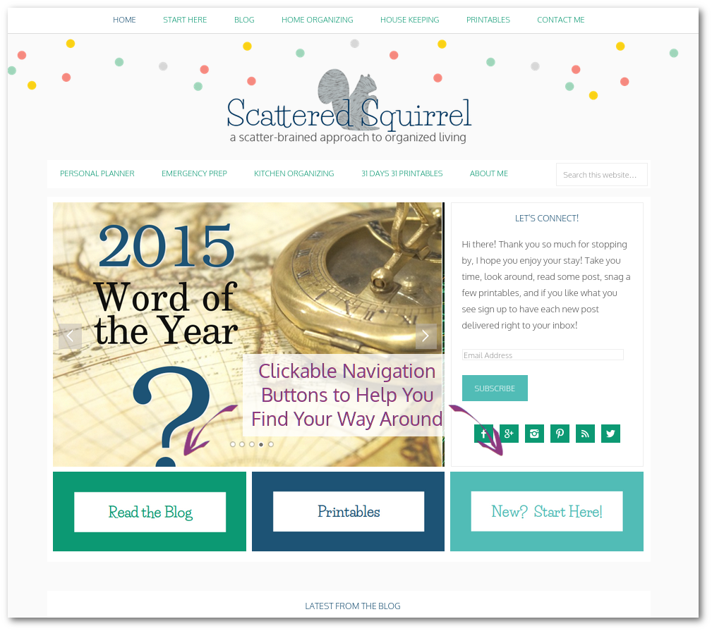
Up first we have the new home page. I went back and forth on this one, as I didn’t want to make things too hard to navigate. But I really like the idea of a static home page. The slider contains the five most recent posts for right now, though in the future I’m hoping to change it to featured posts. To help make navigating easier, there are three clickable buttons that will take you to the Blog Page, the Printables Page, and the newly created Start Here page. I love using buttons and clickable images where I can, as I find that they are much easier to use than text links, especially when you’re viewing from a mobile device. If you scroll down a little further on the home page you’ll find links to our most recent posts, so if you just want to hop in to see what is new, it’s right there.
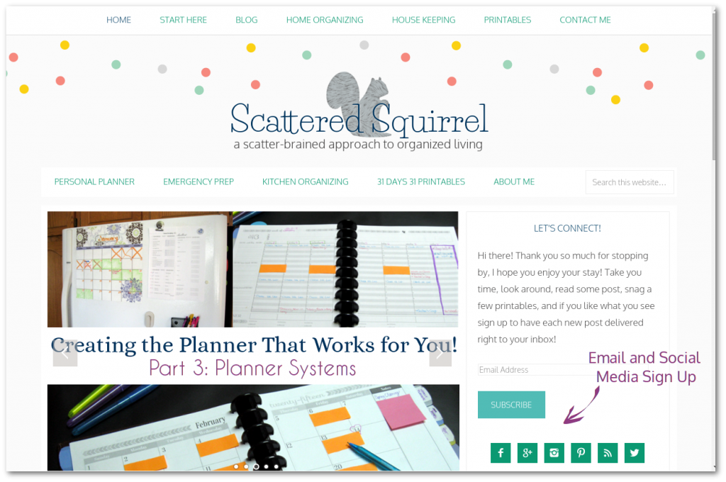
Beside the slider on the home page you can find our subscribe options. I currently don’t offer a newsletter, but you can sign up to receive each new post in your inbox. They get sent out the minute I hit that publish button. Or, you can check out what’s happening on our various social media channels by clicking their icons. (again, I love clickable images! 🙂 )
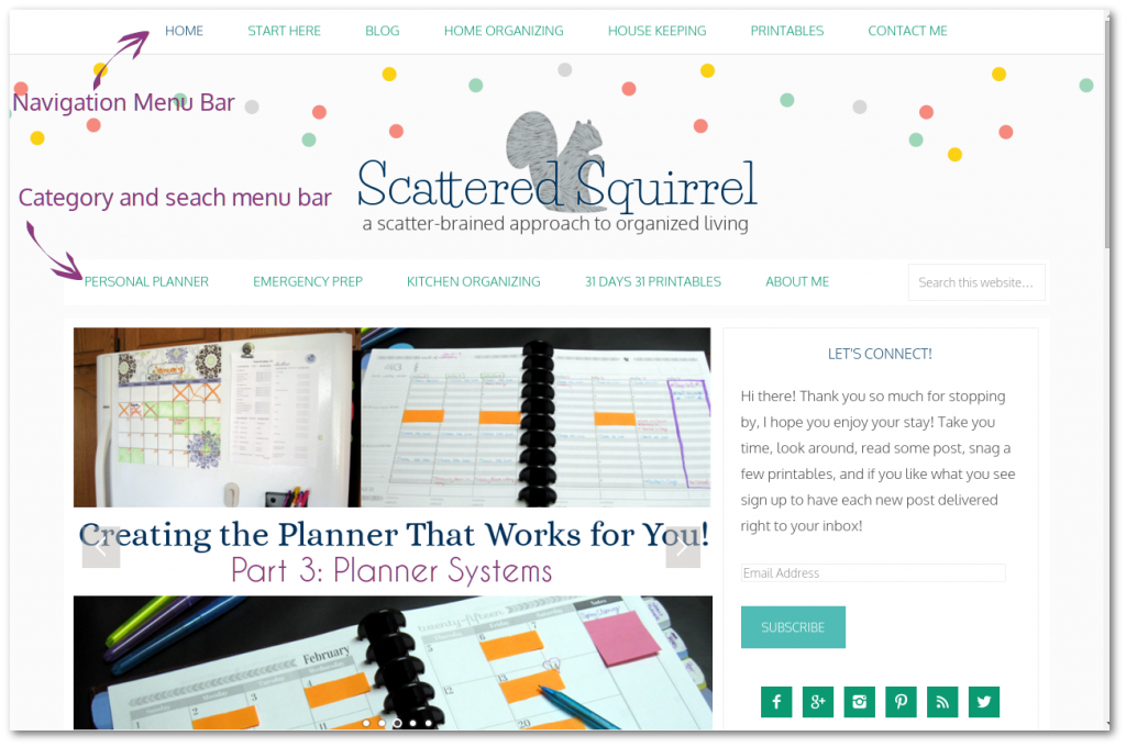
The menu bars threw me for a bit of a loop because that top bar stays at the top of the window when you scroll down, so I had to spend some time thinking about what I wanted to put on it. Because the bar scrolls with you and because I no longer have a back to top button, I tried to make sure I filled it with places you might want to go after reading a post. After spending some time sifting through Google Analytics, I chose the top three visited categories to link to in this bar, and the next four for the second bar. It seemed better than trying to guess what would get the most use.
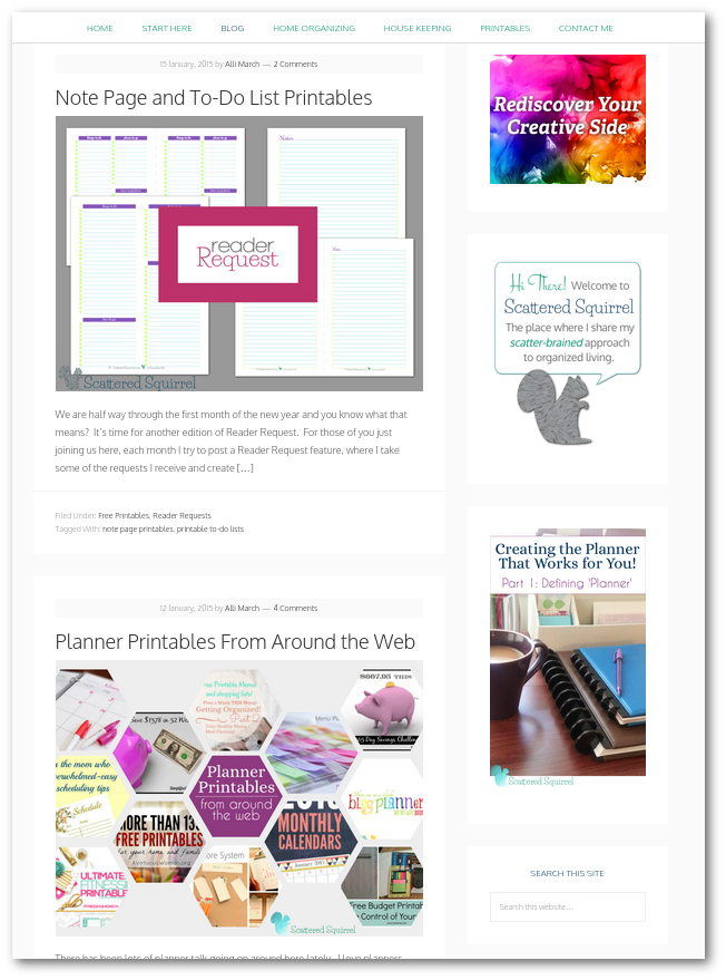
The blog page is pretty much the same as what my old home page used to be. It’s there because I know that there are lots of people who like that layout. If you look at the top of this pic you’ll see what I meant about the top menu bar. It just follows you down the page. As you can also see, there is a little more room between things on the side bar which make it a little less cluttered looking, even though I still have the same number of things on it.
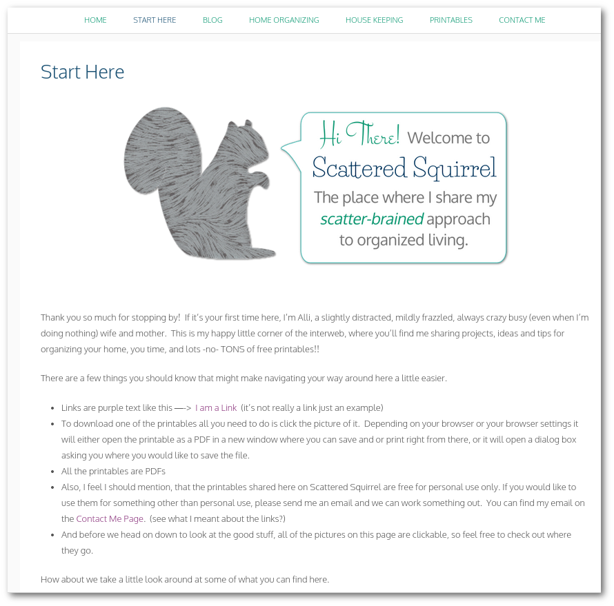
The Start Here page is a new addition. As this site has grown and changed it’s become harder and harder for new people stopping by to find things. So I put together this page and to some tips that might be helpful, such as “all links are in purple text”, and “most images are clickable”, and so on. As well as highlighted some of my favourite posts in some of my main categories. Eventually I wouldn’t mind adding a FAQ section to this page as well, so stay tuned.
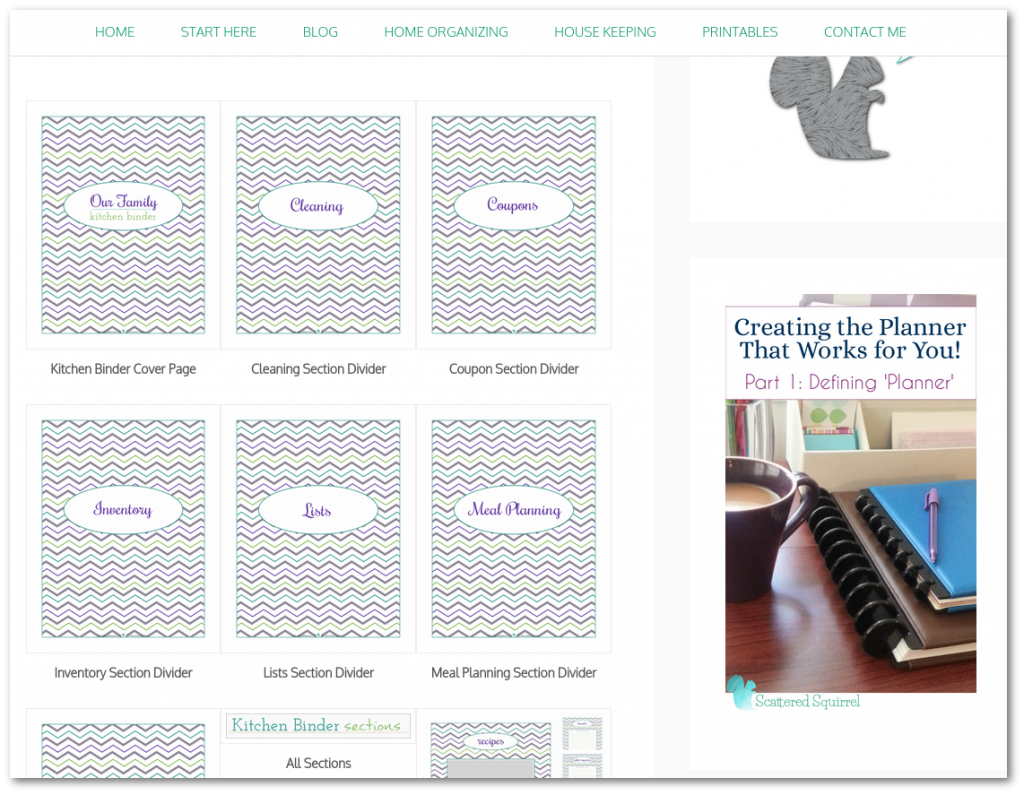
And last but certainly not least… can we just take a moment to ooooh and aaaaah over the new galleries on the printables pages. Maybe it’s just me, but I love how they turned out. Even the ones that I left as two column galleries look much better. I don’t know what it is about this theme, but the spacing and alignment in the galleries is just incredible. I am in serious love! When I first made the printables galleries, this is what I saw in my head and I’m so thrilled that I can now see it on my site too.
Well, what do you think? It’s not too different, just some tweaks here and there and some behind the scenes functions that the old theme didn’t have. Two years ago when I first moved the blog to WordPress, putting together a site like this one was still a dream and a long-term goal. When the stars aligned and I was able to invest in not only the Genesis Framework but the theme as well, I was on cloud nine. It was really hard not pull the site down and put up the new one right then and there, but I had to take a few weeks to get things set up, create some new graphic, deal with my computer dying and all that fun stuff. And now, here it is, and I couldn’t be happier with how it turned it out.
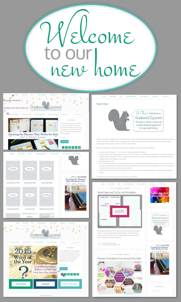
Tell me true, what do you think of our new digs?
