A Little Organizing on the Blog
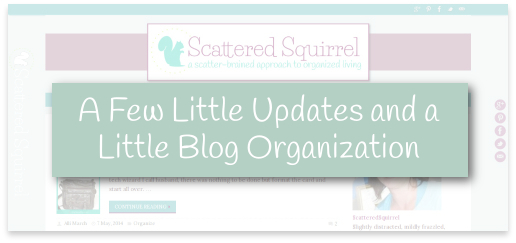
Happy Monday everyone and a belated Happy Mother’s Day! I hope you all had a great weekend. I had one of those weekends where I thought I had bitten off more than I could chew, but in the end the results were so worth it. If you’re reading this post via email or RSS then you probably can’t see what I’m talking about, but my little corner of the blogosphere got a little bit of a face-lift and some much-needed updating and organization. Allow me to take you a little tour.
I’ve been working on this project off and on for months now. Because of some of my other goals, I decided to move up my time-table. What you won’t see is all the last-minute changes I made to all those months of work, including completely ditching the color scheme I had been using and somehow ending up with one I like even better. All in a matter of a day and a half! Crazy, I know, but it worked! I started playing with the color scheme in some of my other posts, and while it worked great for post graphics, once I changed the colors on the site to match, it looked HORRIBLE. No matter how I changed it, those colors just weren’t working for me. In the end though, I ended up with my two favorite colors, so really, I can’t complain.
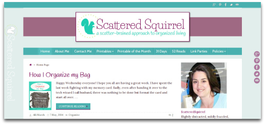
My favorite part is the header. Headers have been such a challenge to try to get right for me. On one hand you don’t want them too big, but on the other, if you make them too small they can’t be seen. And how to dress them up without making them too busy? I think the one I ended up with is just enough of everything all rolled into one.
Since I was refreshing everything anyway, I decided to take the time to organize the blog a little more. I focused on the side bar and footer mainly, though I did move a few pages around too. The biggest change was to the footer where I put all my social media widgets.
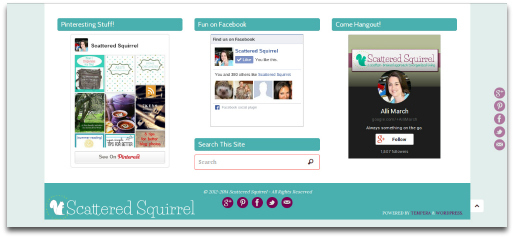
It’s kind of nice having them all together. I also added a search bar, just in case you get to the end of the page and want to look something up. If you look to the right there is a small button beside the blue bar, that’s the scroll back to top button. I switched themes, so while I still have everything I did before, some things look a little different. Those social media buttons on the side and in the blue box are a perfect example of keeping things the same but changing them up at the same time.
Speaking of keeping things the same, but changing them up, I finally got around to updating the About Me page. I’ve had that on my blog to-do list for … well, since I made my first one.
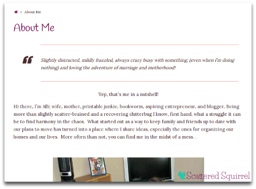
I really don’t like to talk about myself, and I never know what to say for things like that. Added to that, I’m really, really, really, uncomfortable in front of the camera, so pictures of me are usually few and far between. Creating that page was a painful process, but in the end, I’m really glad I did. I hope I gave you the right mix of who I am and what the blog is about.
The final addition, though not as painful as the About Me page, but just as tough to create was the Contact Me page.
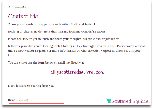
Yes, it has taken me a long time to put one up. How on earth does one word things on pages like that so that it doesn’t sound corny, or silly, or weird? If you have an answer please let me know, because I finally had to stop fiddling with it, and just put it up, otherwise it would have ended up being in draft mode for ever!
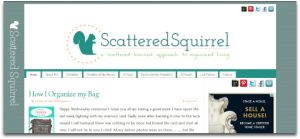
And that my friends brings me to the end of the tour. Before I leave you how about one last look at the old site in the form of a before and after?
You know, aside from the name of my blog, that squirrel is the only thing that has been a constant in my header. It is also the first graphic I ever made, and it was such a long, tedious job that I don’t think I will be changing him any time soon. 🙂
So tell me true, what do you think about the new look?
